
For Something Simple, Minimal Design Sure Is Complicated
THERE’S A RUMOR going around about minimal graphic design. “A lot of people say it’s really easy,” says Stuart Tolley, who runs a design studio in Brighton, England, called Transmission. “A lot of people say you just rely on Helvetica, or white space. And I completely disagree.”

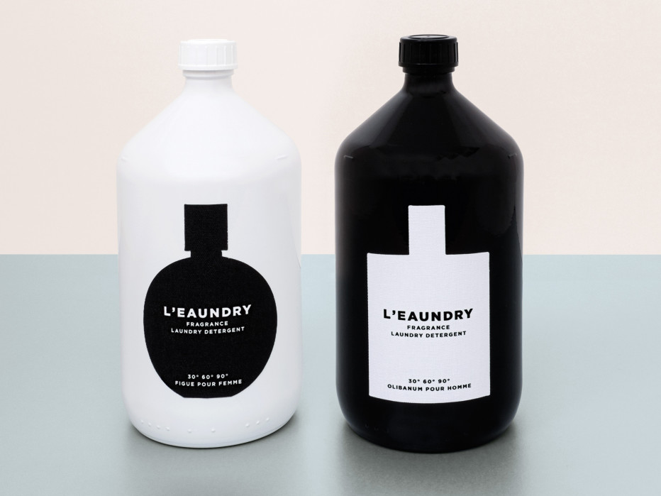
Perhaps you know, or are, one of these people who feels fatigued by how trendy it’s become for companies to use stripped down design to convey friendliness, or force icon status. But minimal design, as Tolley sees it, isn’t simply a matter of ‘less stuff.’ It’s an exercise in economy of expression. To argue his point, Tolley wrote a book. MIN: The New Simplicity in Graphic Design is a catalog of branding, packaging, and editorial work. Every entry is understated in style, and was created within the past four years; but the 160 designs featured in the book, available now from Thames & Hudson ($35), vary broadly.
“I wanted to prove that minimal design can be really experimental,” Tolley says. To create the right mix, he self-imposed a few curatorial rules. First, no personal projects. Everything in the book should be representative of work that made it to market. Second, no retro designs. To prove that clean design is fresh and smart, Tolley would need to demonstrate that it has evolved from the 1950s-era Swiss Style that helped make typefaces like Helvetica and Akzidenz Grotesk popular. The examples Tolley picked fall into one of three stylistic categories: reduction (in which work is stripped down in creative ways), production (in which the character of the work comes from the tactile quality of print, rather than graphic design elements), and geometry (in which shapes feature prominently).
There’s a lot to choose from these days; pared down design is having a moment. “I’ve been looking into why simplicity is becoming quite important,” says Tolley, who has a few theories. “I think a lot of people are inspired by using iPhones and iPads.” There’s also the natural ebb and flow of design trends. Not so long ago, maximalist, ornamental design was the status quo.
Here’s a quick example: in 2011, Warby Parker co-founder Andy Katz-Mayfield had a mediocre shopping experience at a drugstore, while trying to pick up razors. The branding was part of the problem: men’s shaving merchandise tends to come wrapped in extreme, metallic, turbo packaging. The design work could easily be for NASCAR. Not all men identify with this persona, Katz-Mayfield reasoned, so why not create a shaving brand for a more classic sort of gentlemen? Soon after, he and another Warby Parker founder launched Harry’s, a low-frills brand that sells simply shaped razors in simply decorated boxes.

Harry’s isn’t featured in MIN, but it embodies a shift towards palate-cleansing design shared by a range of goods showcased in the book. There’s a line of food products that come in stark, all-white packaging. Cut-outs let consumers see the actual food, letting the product sell itself. The Gentlewoman, a beautiful magazine that launched in 2010, could be seen as an antidote to the exclamatory neon layouts found in other women’s periodicals lik eCosmopolitan or Glamour. The Japanese brand Askul even carries batteries with no design other than a color and a number that connotes the size.
That’s the look for now. Soon, Tolley says, the tide will turn back. “In the next few years, there will be a more expressive graphic trend that comes up.” In that light, MIN is like a time capsule for this particular era in graphic design—one characterized by an aesthetic that is simultaneously computational and artisanal, and bold in its simplicity.
Article Written By: Margaret Rhodes
0