

Taco Bell Reveals New Logo
American fast-food chain Taco Bell has unveiled its first logo redesign in 20 years.
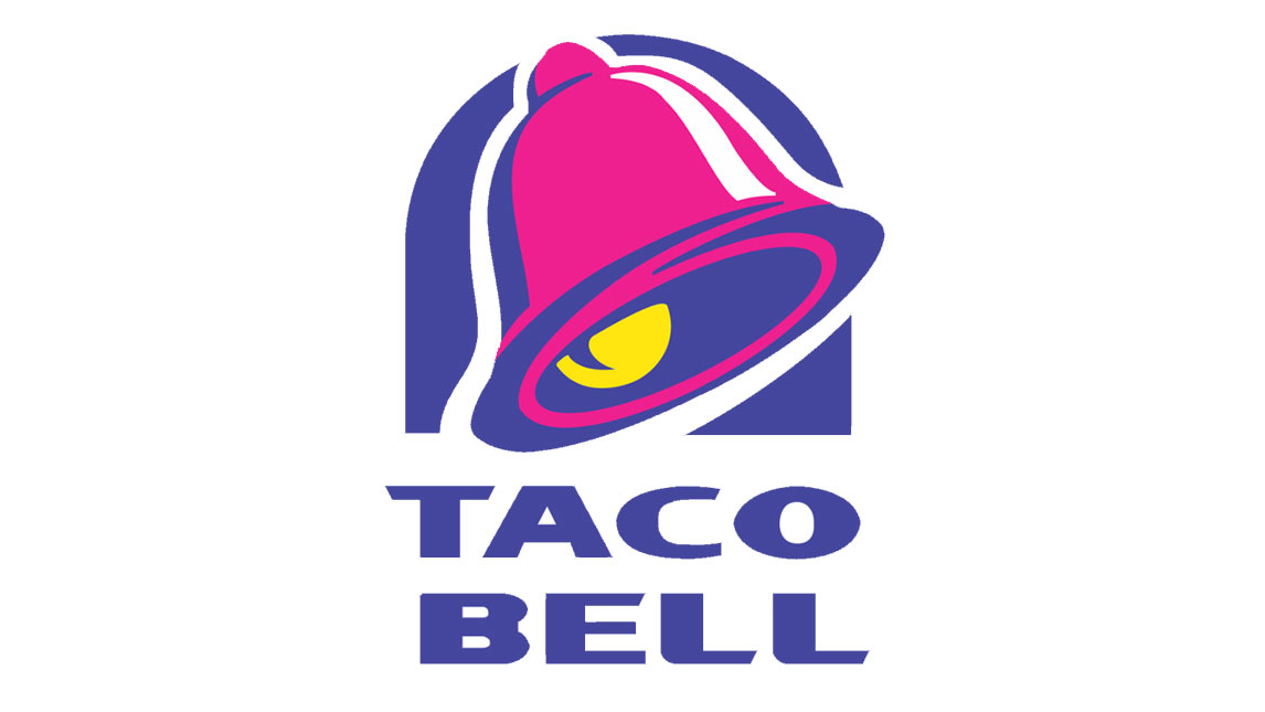
Popular American fast-food chain Taco Bell has revealed its new logo design this week, which replaces previous branding that has been in place since 1995. Developed by creative consultancy Lippincott and Taco Bell’s internal design group, TBD, the revamped logo simplifies existing imagery in an attempt to connect with young diners.
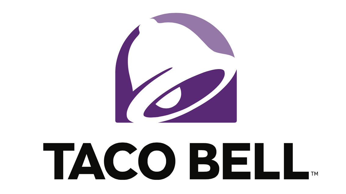
Rather than creating something entirely originally, the new logo tweaks and streamlines the familiar bell image associated with the restaurant chain. Gone is the palette of gaudy blues, pinks and yellows which might have been trendy in the mid ’90s, replaced instead with a regal purple complete with a subtle gradient shading.
The longstanding Taco Bell wordmark has been updated as well. While the previous font was a curious blend of curves and sporadic slants, the new lettering is a straightforward black variant of the Gotham typeface.
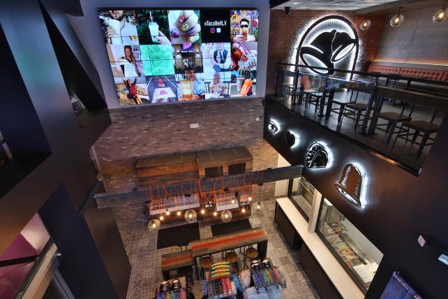
Thanks to its stripped back design, the new logo allows for more customisation with colours, patterns and textures. These include variations brought to life with sparklers, toasted onto flatbreads, and other creative angles that will appear across Taco Bell’s digital channels first, before rolling out to their restaurants and packaging.