
Coca-Cola bottles and cans getting a major makeover
The Coca-Cola Company has announced a new packaging roll out as part of a global strategy to unify the brand and tie it back to the beverage’s iconic red packaging
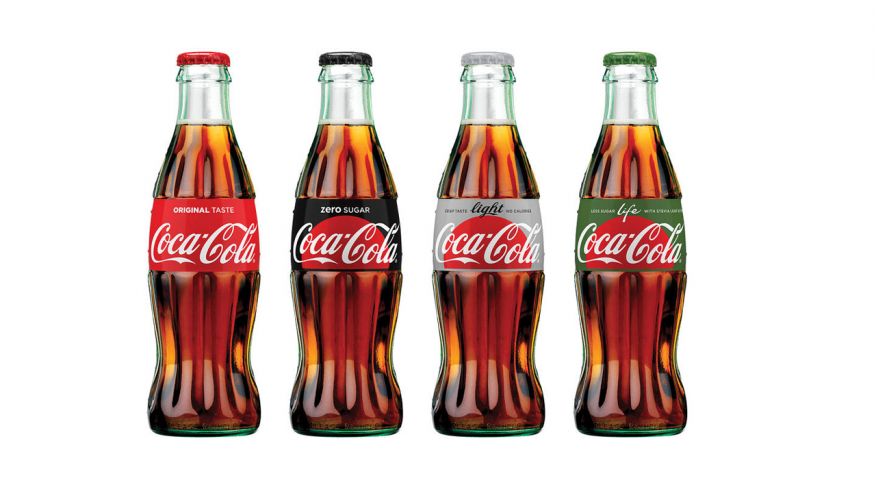
Yesterday, the soda giant unveiled its “one brand’’ graphic which will debut next month in Mexico and roll out across cans and bottles for all of its zero- and low-calorie beverages across much of the world by the end of the year. According to the Wall Street Journal, the packaging ploy is part of a larger effort to boost sluggish sales and tackle more concerns over Coke’s product health.
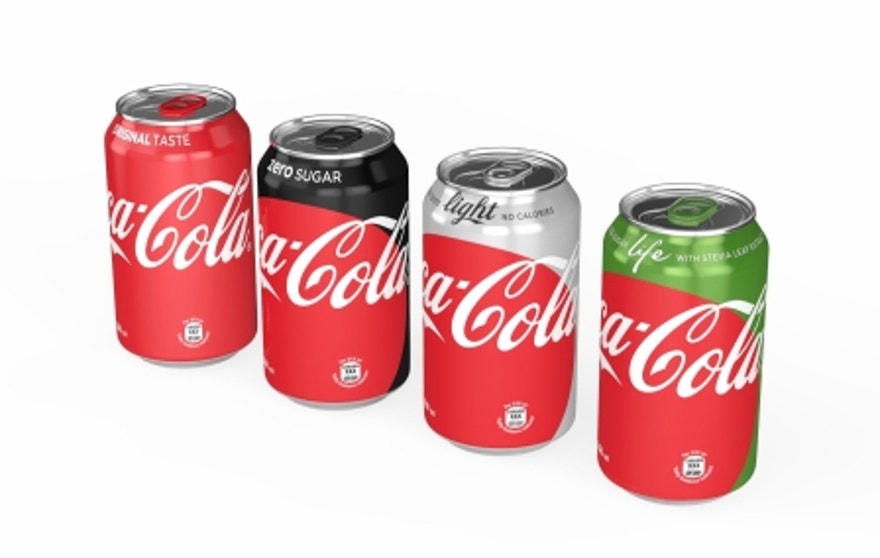
“Packaging is our most visible and valuable asset,” Marcos de Quinto, Chief Marketing Officer, The Coca-Cola Company, said in a statement.“The Coca-Cola Red Disc has become a signature element of the brand, synonymous with great taste, uplift and refreshment.”
De Quinto says the “one brand” strategy will help customers quickly identify Coke products—but the new graphics will also include the unique product name, and easily discernable calorie counts on the front of the can or bottle to help consumers make a “more informed choice.”
Until now, silver has been the primary packaging color for Diet Coke, known as Coca-Cola Light in many non-U.S. markets. Coca-Cola Zero, comes in black packaging and Coca-Cola Life, a mid-calorie cola made from natural sweeteners, is green.
“The unification of the brands through design, marks the first time in our 130-year history that the iconic Coca-Cola visual identity has been shared across products in such a prominent way,” said James Sommerville, Vice President Global Design for Coca-Cola.
The new packaging graphics were revealed at an event yesterday evening to celebrate the roll out of the “one brand” approach. Coke customers will start seeing more red in Mexico during the first week of May.
Article Written By: FoxNews.com
0